Armstrong Commercial
Giving products and applications a clear place on the homepage.
Commercial customers could approach the range by product type or by the space they were designing. I redesigned the homepage around both routes, balancing collection stories, project inspiration, and technical resources with flexible sections the team could update.
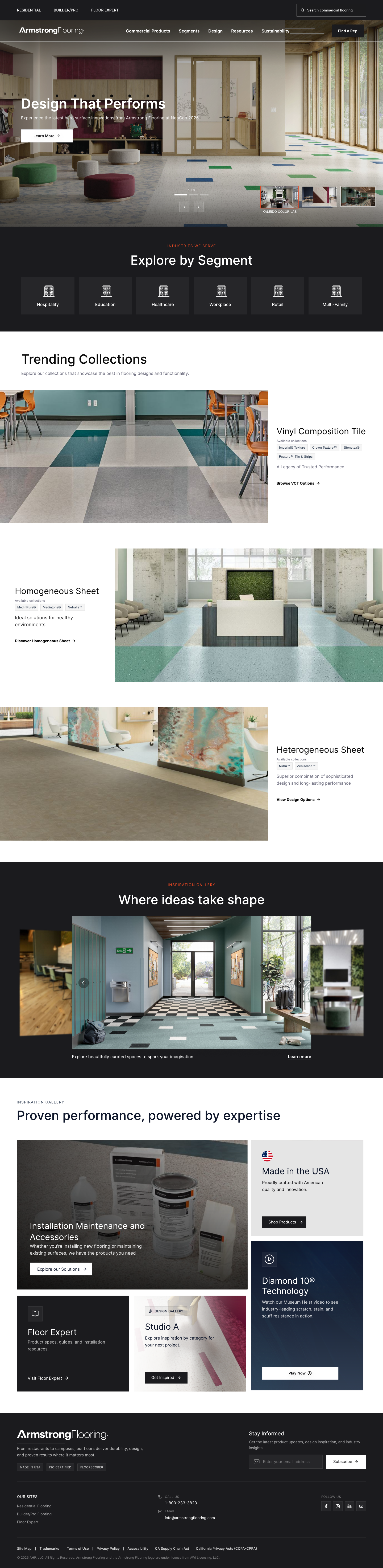
THE HOMEPAGE, REFOCUSED
Inspiration with a clear next step.
Featured flooring leads into six market segments, giving commercial customers a direct route into relevant applications.
View full homepage designDESIGN IN DETAIL
The priorities behind the layout.
A route by application
Six market segments give visitors a starting point based on the spaces they design.
Space for product stories
Collection features combine imagery, concise copy, and a next step instead of treating every product as a grid item.
Room for changing priorities
Reusable sections accommodate different collections and campaigns within a consistent hierarchy.
Two ways into the same offering.
Set the first release around the homepage and navigation. Product discovery and application needs both deserved a clear starting point, while collections, project examples, and technical resources needed their own places further down the page.
A hierarchy that carries through the page.
Organized featured flooring and six market segments ahead of collection stories, real projects, and resources. Typography, spacing, imagery, and calls to action distinguish each section while keeping its next step visible.
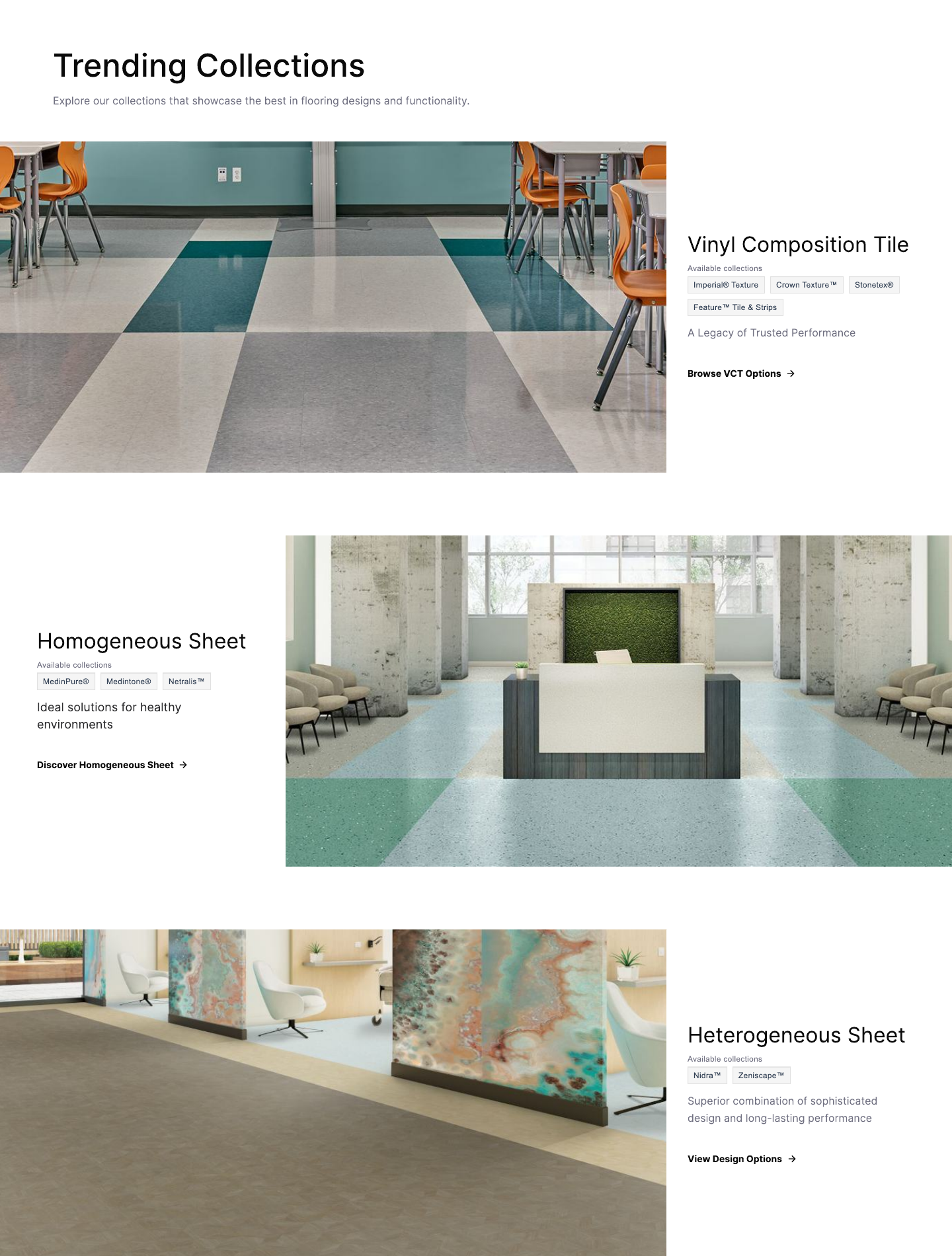
Design for the content that comes next.
Designed reusable collection features with space for different imagery, copy, and calls to action. Worked through asset and content choices with marketing and product partners so new collections and campaigns could use the same page structure.
Preserve the priorities as the screen changes.
Designed desktop, tablet, and mobile layouts together, adjusting content flow, image treatments, and spacing to keep products, applications, and next steps clear at each size.
From design decisions to the finished build.
Prepared the handoff, resolved development questions, and reviewed responsive behavior, content, and links during QA. Coordinated launch readiness with the team for the January 22, 2026 release.
Clearer priorities
A deliberate hierarchy connects products, industries, inspiration, and support.
More room to merchandise
Flexible sections give featured collections and changing campaigns a consistent place on the page.
A maintainable foundation
Repeatable layouts support ongoing content updates and future site improvements.